Katalyst Solutions - Web Design & Web Development serving Sterling, VA & Loudoun County & Fairfax County & Northern Virginia

Not Using Responsive Design May Be Costing You Business
Imagine this… you’re away from your computer and pull out your smartphone to find some critical information (like what’s the address of that new restaurant?), but you end up on a website that definitely isn’t mobile-friendly. You are trying to view a website, but you can hardly read it. You are pinching and squeezing and zooming and scrolling just to read the page. Then you try to click a link, but hit the wrong one and have to wait forever for the new page to load so you can try again. Finally, you give up and go back to Google to find a different website.
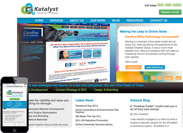 Click to enlarge
Imagine this… you’re away from your computer and pull out your smartphone to find some critical information (like what’s the address of that new restaurant?), but you end up on a website that definitely isn’t mobile-friendly. You are trying to view a website, but you can hardly read it. You are pinching and squeezing and zooming and scrolling just to read the page. Then you try to click a link, but hit the wrong one and have to wait forever for the new page to load so you can try again. Finally, you give up and go back to Google to find a different website.
Has this ever been you? Worse yet, has this ever been a visitor to your website?
It doesn’t have to be that way. You don’t have to lose that business! It’s time to get responsive… Responsive Web Design that is!
Your Prospects Are Going Mobile. Are you?
The future of the web is mobile. The future is here.
The US and the world in general is increasingly using mobile devices as the primary means of browsing the web. An article on Smart Insights provides some interesting data on this trend:
- According to Google, 20% of all searches are performed on mobile devices.
- According to Bing, 50% of all local searches are performed on mobile devices.
- Bing expects mobile Internet usage to take over desktop Internet usage in 2014.
As a business and website owner, you are faced with a dilemma: make your website mobile friendly or give a large portion of your visitors a bad experience and potentially lose their business.
We’ve made a business decision that all of our websites going forward will use mobile friendly, “responsive” designs. Here is some of the thinking behind our choice:
Mobile Options
There are generally two broad approaches to mobile-friendly websites.
Mobile Only Site
A mobile only site is a site specifically designed for mobile devices. Typically, the main site will try to detect whether the visitor is using a desktop or a mobile device and redirect the mobile user to the mobile version. A variation on this is to try to detect what device the visitor is using and serve different content in a format specific to that device. This can be pretty challenging and can be a lot of extra work to maintain.
Responsive Design
In most cases, the better option is to use what is called “Responsive Design.” It gives the same content to the visitor but changes the layout to “respond” to the visitor’s device.
Responsive Design Defined
“Responsive Design” is a term that was coined by Ethan Marcotte in a 2010 article titled “Responsive Design.” Responsive design is by far the most popular method for designing mobile-friendly websites.
In a nutshell, responsive design is a web design approach that allows the website to “respond” to the device being used. It automatically reformats the layout based on the width of the device’s screen. It can change how the menus are displayed, what size the text is, reposition content so that it makes more sense on smaller screens, and much more. I won’t bore you with the geeky, techie details, but feel free to Google it if you want a deeper understanding.
5 Benefits of Responsive Web Design
There are many benefits to using responsive design. Here are a five reasons you should consider using responsive design:
1. Positive Mobile User Experience Boosts Traffic and Conversions
Google’s Think Insights has tons of data on how site redesigns to be mobile friendly greatly increased the mobile users’ experience, which in turn greatly boosted the website’s traffic and conversion rates.
2. Using a single URL Makes it Easier for Google/Bing and Helps Your SEO
The single URL makes for it easier for your users to interact with, share and link to your content.
It also helps the search engines have a clear page to know which to link to and show in their search results. If you have separate pages for the desktop version and a mobile version of the page, it is unclear which one should be prioritized in the search results.
3. No Redirection Needed – Faster Page equals Better User Experience
Trying to redirect based on the visitor’s device is prone to errors and can degrade your visitor’s experience with longer load times. A bad experience with your website can also mean a bad impression of your business.
4. The Same Website for All Devices – Improved User Experience
Oftentimes, users will conduct their initial searches on a smartphone or tablet and then finish up the research and/or make a purchase when they get home or back to their desk. With a site that works well on multiple devices, they can have a positive user-experience no matter what device they are using. If they are visiting a mobile only site, then they will have to relocate the information again, potentially causing frustration. Of course, if the site wasn’t mobile-friendly in the first place, then there’s a good chance they wouldn’t revisit it when they got back to their desktop.
5. Google recommends it
Let’s face it. In the world of search, Google is the 800lb gorilla. When Google makes a recommendation, it is wise to consider it. And Google recommends the use of Responsive Design.
But My Visitors Don’t Use Mobile…
If you are looking at your analytics and not seeing very many mobile users, it may be because your website is not mobile friendly. Google may be less likely to send mobile users to your site and the mobile users that do visit, may quickly leave.
Conclusion
Mobile is the future and the future is here. Mobile already represents a huge portion of web traffic and that number is expected to grow. If you are losing business because of a mobile “unfriendly website,” it may be time to implement a responsive design approach. Make your customers happier and reap the benefits of better SEO.
Blog
“Don Cranford and Katalyst Solutions are excellent collaborators. They bring a wealth of knowledge and are a pleasure to work with. Katalyst Solutions are truly experts.”
– Dorothy Banzon
Owner/Designer
D Banzon Design
